TikTok’s Add Button Isn’t Centered
I’m making yet another mobile app with a 5-item nav bar, but this time I’m obsessing over the design and placement of UI elements in the major 5-element nav bar apps.
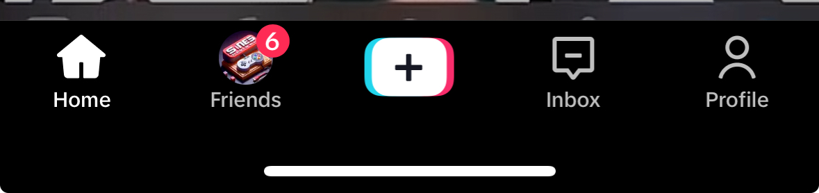
Doesn’t the nav bar on TikTok look a little off center?
It turns out, yes, by 1 pixel on my iPhone 14 Pro.
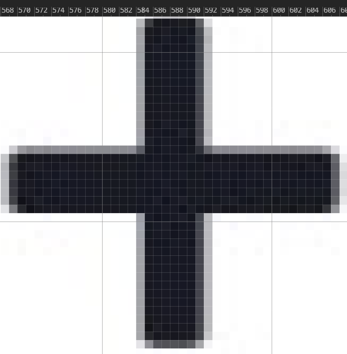
The iPhone 14 Pro is 1179 pixels wide.
The dark parts of the plus sign is 6 pixels wide. There’s one pixel of shadow on the left and two on the right side of it.
We’ll say the center is at 588, between the pixel ending at 588 and the pixel starting at 588.
Photopea is actually 0-indexing pixel indices, so that’s actually the 589th pixel, which means that there’s an extra 1 pixel on the right side of the plus sign.
1 pixel is awfully small, so there must be some other reason why I felt like the nav bar isn’t centered.
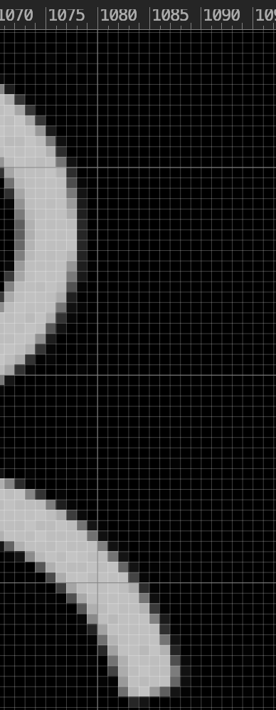
I think it’s because the home button’s left margin is at the 82nd (so really the 83rd) pixel, and the right-most margin of the Profile icon is either at the 1088 (so 1089th) pixel, or the right part of the profile icon’s head is at the 1078 (so 1079th) pixel.
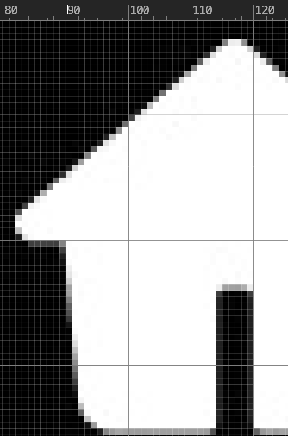
I’m guessing the imbalance of 82 pixels from the left and either 90 or even 101 pixels from the right is making me feel like it’s imbalanced and now I can’t unsee it.
The center of the first icon is at 118 pixels and the center of the last icon is at 1061/1062 pixels, so they’re centered perfectly.
The widths of the icons are all different. The add button in the middle is largest to encourage you to create content.
They must have run extensive studies on the exact width of those icons and optimally placed these icons to maximize engagement.